If you have been following this series of articles, you have chosen a domain name, picked a good hosting provider and decided on your content management system. The next step is to design your website.
There are a few ways you could go about doing this – you could find a good web designer familiar with your CMS system and hire them to design the site for you, or if you are like me and like to learn how to do things yourself, you could design your own site the way you want it.
Before you start worrying that you know nothing about design, let me tell you that you don’t need to. These days many CMS systems have templates pre-built. So in most cases you can start with one of these and customize it to suit your needs. So if you are interested, and willing to get your hands dirty you can do it yourself.
This is how I started with design – by picking a template and adjusting it to suit my needs. Along the way I learned what the different CSS items meant, as well as what the corresponding HTML code also did.
By starting with a current design (many of which are free) I was able to identify the items I needed to change, researched how to change them and then made the changes myself.
Considerations when choosing a site design
It is 2013 now, so one must consider not only what the site will look like but how it will function with today’s modern computers, tablets and smart phones.
Colors and logos aside, this is the most important consideration in my mind – deciding on a pre-built theme (if you are a DIYer) that has some sort of mobile component. Whether you chose to build 2 sites (a desktop version and a mobile version) or chose the more adaptable Responsive style, now is the time to make that choice.
Personally, I would rather build a site using the responsive theme style. To me this seems to cover the bases better and allow for future screen sizes and resolutions better than a standalone mobile theme.
Another reason to choose a pre-built theme to start is that the theme creators tend to provide free updates to the theme to fix code flaws and provide enhancements for when web technology changes.
For example, I would expect the designers of a responsive theme to adjust the theme if/when a new screen size and resolution becomes popular.
Making changes to the prebuilt theme
If you do go the route of changing a prebuilt theme, I’d suggest one that allows for what are called “child” themes.
Child themes allow you to customize theme without making any physical changes to the “parent” or main theme.
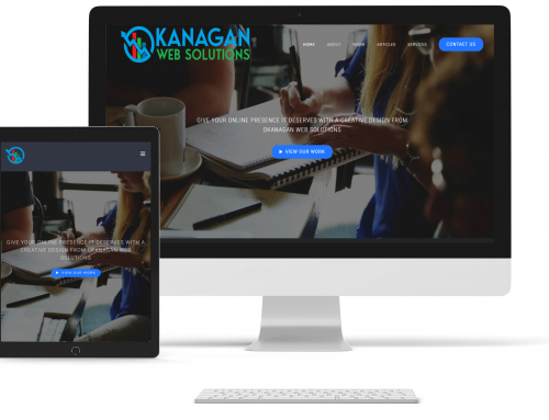
For example, this site uses a customized child theme which uses a responsive them for the base. The responsive theme handles most of the “heavy lifting” when it comes to displaying the site, but the child theme allows us to customize elements such as the colors of the navigation, hyperlinks, background and logo.
Another benefit of using child themes is that you can update a parent theme without losing your customizations.
If you make changes to a theme and don’t use a child theme, when there is an update to that theme you risk losing your customizations. By creating a child theme to run on top of the parent theme, updates won’t wipe out your changes.
Child themes are quite handy because they don’t just affect the style of the site, you can also change elements such as the pages, widgets, headers and footers.
Again, using this site as an example, we have a custom header and footer along with our custom CSS. The child theme’s header and footer replace the parent theme’s header and footer while all other template items remain the same.
If we wanted to add or change more theme elements, we’d simply copy the parent theme element into our child theme folder and make the changes there.
Creating your Custom Design
So now that I’ve given you a brief introduction into child themes, it is time to look at making the actual changes.
Again, with many modern free themes, they have some built in tools to help you customize the design. From uploading logos to customizing the look of the other visual elements, such as navigation, you will find many themes have these built in to help make changing the theme easier than you might expect.
Previous to using the responsive theme for this site we tried a few different ones. There is a WordPress theme called “Graphene” which not only allows for child themes, but also has a great set of built in tools to allow you to fully control and customize the look and feel of your site. From defining the column widths and locations to deciding how many, and in what order, sidebars should appear to background layouts, colors and images. Of course you can also make changes to your navigation’s appearance, widgets and so on as well.
Best of all, when it’s all done and you are satisfied with the look, you can copy the CSS into a child theme to save it. Then, when the parent theme is updated you won’t lose the changes you’ve made.
In our next article we will delve into Child themes a little more to help you with the design process.